Design & AI Workflow

When to Use AI, When to Hire a Designer: A Real Experiment

By Entify design team

·

5 min read

·

5/1/2026

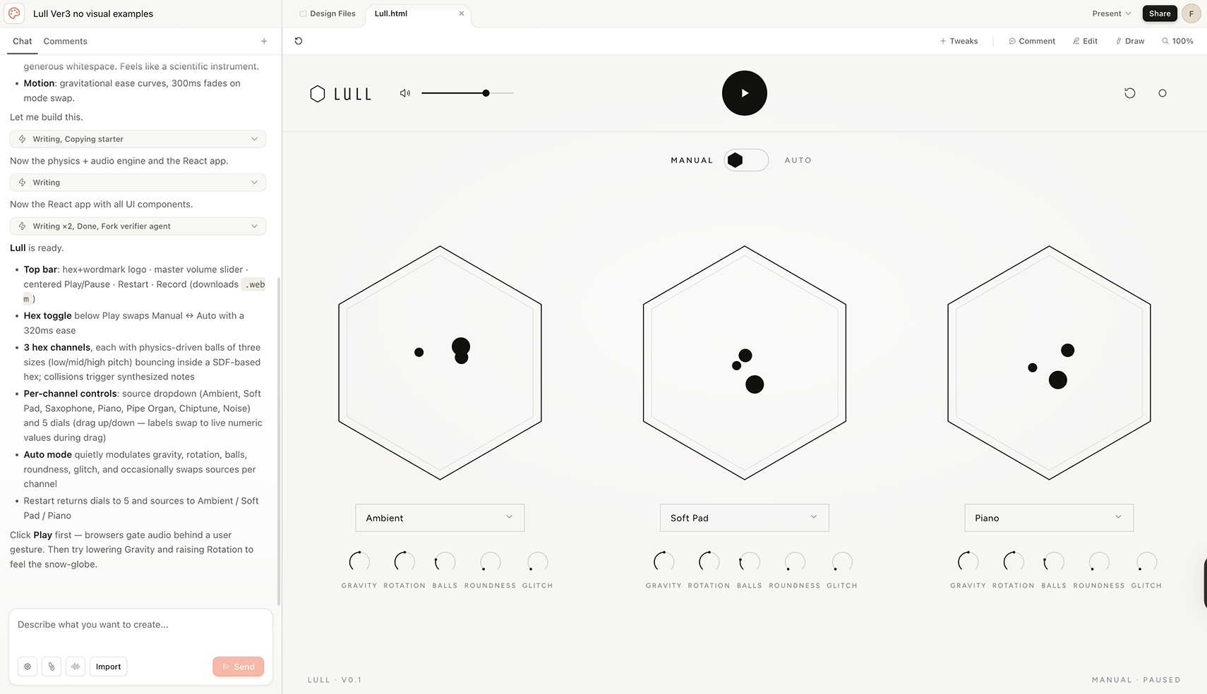
We gave the exact same detailed text prompt to two AI tools — Claude Chat and the newly released Claude Design — with no Figma mockups attached. Not because we didn't have them — but because most startup founders don't.

Bring in a designer when the work shifts from "does this concept work" to "does this product feel exactly right."

The workflow We'd recommend to any founder

Based on this experiment — and on working in design across early-stage products — here's a practical roadmap. Not theoretical. Not defensive about AI. Just what actually makes sense given the tools that exist today.

Product development roadmap
Phase 01
Validate the concept
Claude Chat

Write a clear brief. Describe your target user, their pain point, and what the product does. Get a working prototype. Test whether the proposition makes sense. Iterate until you get a signal — positive reaction from real users or your own gut.

Human designer: not required yet
Phase 02
Refine the experience
Claude Design + Human Designer

Move to Claude Design for deeper UX iteration, visual direction, and motion. This is where a human designer enters — to make the decisions AI struggles to make alone: what specific feeling should this product create, and how do hundreds of small decisions point toward it consistently.

Human designer: essential here
Phase 03
Build it
Figma MCP + Claude Code

Once design decisions are solid, move to development. Figma MCP reads the spec precisely. Claude Code builds. Human developers review critical flows and ship. The design decisions made in Phase 02 translate directly — no reinterpretation needed.

Human designer: handoff and review

When do you actually need a designer?

Here's a practical guide, not a sales pitch.

Situation Phase AI Tool Designer
Exploring an idea, no direction yet 01 Claude Chat
Testing whether the UX concept works 01 Claude Chat
Iterating on interactions and motion 02 Claude Design Optional but valuable
The product needs to create a specific feeling — calm, playful, trustworthy, premium — consistently across every screen 02 Essential
Visual hierarchy and brand consistency matter 02 Essential
Conversion or retention problems to solve 02 Essential
Ready to build — design decisions locked 03 Figma MCP + Claude Code Handoff review

The key insight in this roadmap: AI is most powerful at the two ends — rapid prototyping at the start, precise development at the end. The middle phase — where the product's specific feeling and visual identity are defined — is where human design judgment matters most. Not instead of AI. Alongside it.

The core insight

AI understands your users. It processes your pain points. It can build a working prototype that a real person can interact with in minutes. That's genuinely remarkable, and founders should be using it from day one.

What AI can't do is hold the full weight of a design intention — the accumulated reasoning behind micro-decisions that together define how a product feels to use. That's not a flaw. It's just where the human designer's work begins.

Real Experiment: Making an app with AI tools

Both tools read the brief with a level of UX intelligence that genuinely surprised us.
Target audience correctly understood

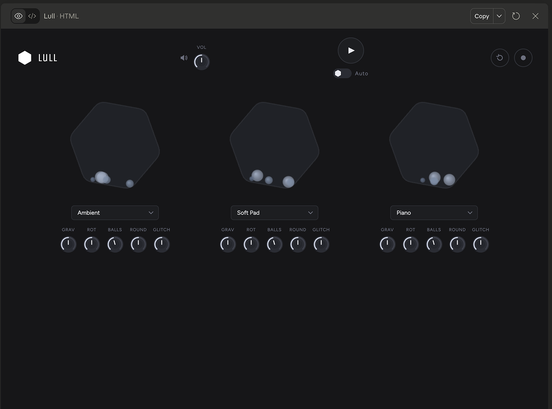
Both tools understood that the user is not a musician. Neither added MIDI controls, tempo inputs, or track labeling. They stripped the interface down to exactly what a non-expert needs — which is precisely what traditional DAW software fails to do.

Pain points processed correctly

The complexity barrier of existing music software was addressed instinctively. Both outputs presented clean, approachable interfaces that would genuinely feel inviting to someone who has never opened GarageBand or Ableton.

Mode transitions executed thoughtfully

The Auto/Manual toggle — which needed to feel smooth and non-disruptive — was handled well by both tools. The fade transitions between modes were clean and matched the minimal visual style I described. This is non-trivial interaction design done correctly from a text prompt alone.

Physics simulation brought to life

Claude Design's gravity simulation for the bouncing balls inside the hexagons was genuinely well-executed — organic, non-mechanical, and aligned with the "alive" quality the brief asked for. Seeing physics described in words become a working prototype is a real capability that shouldn't be underestimated.

No feature creep

Neither tool added features that weren't asked for. No onboarding tooltips. No help menus. No unnecessary complexity. For a brief explicitly designed around radical simplicity, this restraint was the right call — and both tools made it without being told twice.

Claude Chat
Claude Design

This matters for founders. If you write a clear brief with a well-defined target user and specific pain points, AI tools will act on that UX intent with impressive accuracy. The days of needing a designer just to get a working prototype with coherent UX logic are genuinely behind us.

Where the two tools diverged

Claude Chat and Claude Design have different strengths, and understanding the difference will save you real time and money as a founder.

Claude Chat
Strong at working prototypes. Made for testing ideas.

Claude Chat produced a functional, interactive prototype from the brief alone. The physics worked. The toggles worked. The sound source selection worked. As a tool for answering the question "does this product concept make sense?" — it's exceptional. The visual component placement was less precise, and the minimalism softened slightly toward convention, but for an early-stage validation tool, none of that matters.

Best for: Pre-design validation. Does the product idea hold up? Do users get it?
Claude Design
Closer to the vision. Better for UX and motion iteration.

Claude Design went further on visual precision and interaction quality. The component placement was more aligned with the brief's intent. The transitions were more considered. But even here, without a visual reference, the tool defaulted to safe, conventional choices in places — a subtle line under a dropdown that wasn't asked for, adjusted letter spacing on the logo wordmark. Small decisions. Each individually reasonable. Together, they shifted the product away from the specific feeling the brief was asking for.

Best for: Iterating UX, interaction design, and motion after the concept is validated.

The gap between intent and execution

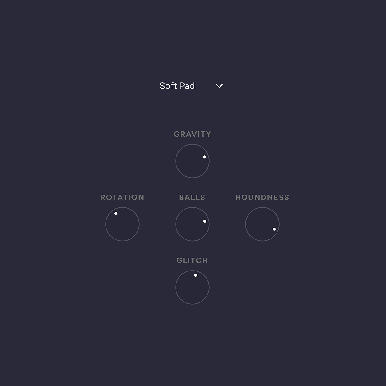
The Figma mockup is the benchmark in this experiment — not because it's perfect, but because it represents fully-held design intent, built independently before a single AI prompt was run. Every decision in it was made deliberately, with awareness of every other decision around it. The dial has no value ring because the user can hear the change in real time — the sound is the feedback. The dropdown has no box because the visual weight of a border would break the spatial rhythm of the hex channels. These weren't happy accidents. They were choices, made in sequence, each one informed by all the others.

AI doesn't know the reasoning behind those decisions. It sees the instruction, makes a judgment call about what's conventional and safe, and executes that. Which is often right. But not always — and for a product whose quality is core to its value, "often right" isn't enough.
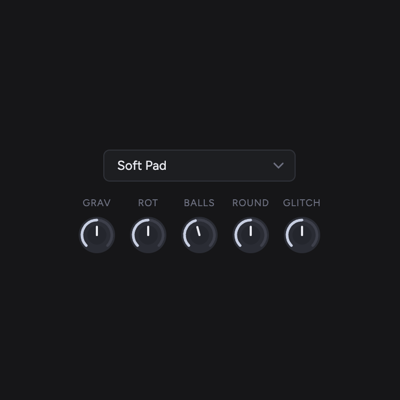
Screenshot from Claude Chat
Screenshot from Figma
That gap — between "clean and functional" and "precise, warm, alive" — is where a human designer lives.
It's not a technical gap. It's an intentional one.
And that knowledge shapes every other decision in the product.

What "the feeling of the product" means in practice

Every product creates a feeling when you use it — whether the designer intended it or not. Notion feels calm and organised. Duolingo feels playful and encouraging. A banking app should feel safe and trustworthy. Lull was designed to feel like picking up a snow globe: immediately beautiful, effortless to start, with a sense of something alive happening on screen.

These feelings don't come from one big decision. They come from hundreds of small ones made consistently: the spacing between elements, which information is shown and which is hidden, how a button responds when you press it, what happens in the moment between one screen and the next. AI can execute individual decisions well. What it struggles to do is keep all of these small decisions pointing in the same direction — toward one consistent feeling — especially when that feeling is subtle rather than obvious. That is the work a human designer does.

You'll know when your product feels like a snow globe. The question is whether you have someone who knows how to build one. Learn more about our design approaches at entifydesign.com/our-works.

← Previous
Next →