
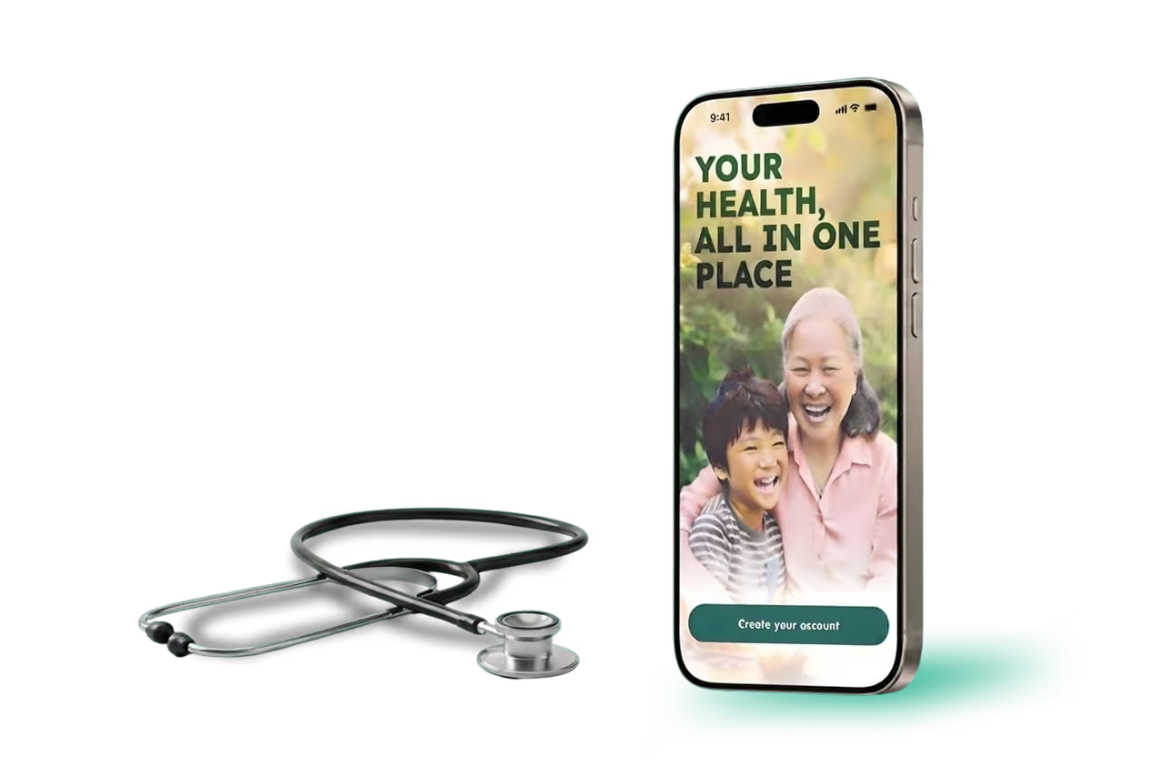
Alongside is a chronic-care coordination app built for the patient who's managing more than one condition at once, and for everyone around them who's trying to help. It connects the patient, their family caregiver, their nurse care coordinator, and their doctor around a single thread of daily data — replacing the four disconnected views each of them works from today with one shared, honest picture.

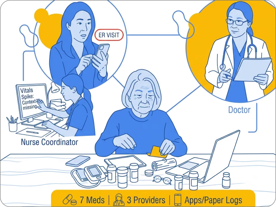
Chronic disease has an information problem, not just a treatment one A patient managing diabetes, hypertension, and depression at once is juggling seven medications, three providers, and a stack of apps and paper logs that don't talk to each other. Their caregiver finds out about a bad week after it's already become an ER visit. Their nurse coordinator is triaging vitals for dozens of patients with no context for what a spike actually means. Their doctor gets fifteen minutes to reconstruct six weeks of their life from memory. Everyone is working from a different, incomplete version of the same story — and the tools meant to fix that usually just add another screen to check.
We chose chronic care deliberately. Clinical Workflow Software led digital health funding at $988.4M over 12 months, with chronic-care flagged as a top funding signal — reinforced by a new Medicare value-based pathway launching in 2026. Beyond finances, healthcare UX research names multi-stakeholder design as one of the hardest unsolved problems — exactly worth a case study.We stress-tested an early assumption. Smart pill dispensers turned out niche — $100–$1,000+, limited to elderly care and trials. That reshaped our tracking flow: Alongside is built around honest self-report, where "I didn't take it" is as easy as "I did."
Every persona is grounded in published research on how each role behaves today, not assumption. Patients with chronic conditions cycle between diligence and lapses, and new prescriptions disrupt habits built over months. Family caregivers are routinely excluded from care decisions, driving documented stress and burnout. Nurse care coordinators triage remote patient data across full panels with limited context, fueling alert fatigue. Physicians already spend 29–46 minutes daily in the EHR, so new patient data must reduce cognitive load, not add to it.

Type 2 diabetes, hypertension, and mild depression. Manages seven medications and sees three providers. Not tech-averse, but overwhelmed by juggling separate apps and logs for a condition that touches every part of their day.

Remote, informally stepped into the role with no onboarding. Wants reassurance, not another dashboard to interpret. Currently relies on phone calls and texts that only tell her something's wrong after it already is.

Manages a full panel of patients, triaging incoming vitals and symptom reports daily. Needs to know who actually requires their attention today, and needs the context to trust that signal.

Sees Maria roughly every six weeks, for fifteen minutes at a time. Needs a synthesized trend, not a raw data dump, so the visit goes to decisions instead of data-gathering.
The current user journey: Three people, managing the same set of conditions, working entirely in isolation from one another. A missed dose during travel never reaches anyone else. The caregiver has context the care team badly needs, with no channel to share it. The coordinator sees numbers with no story behind them. Each of them ends the week a little more anxious, a little more locked out, or a little more prone to missing something real.
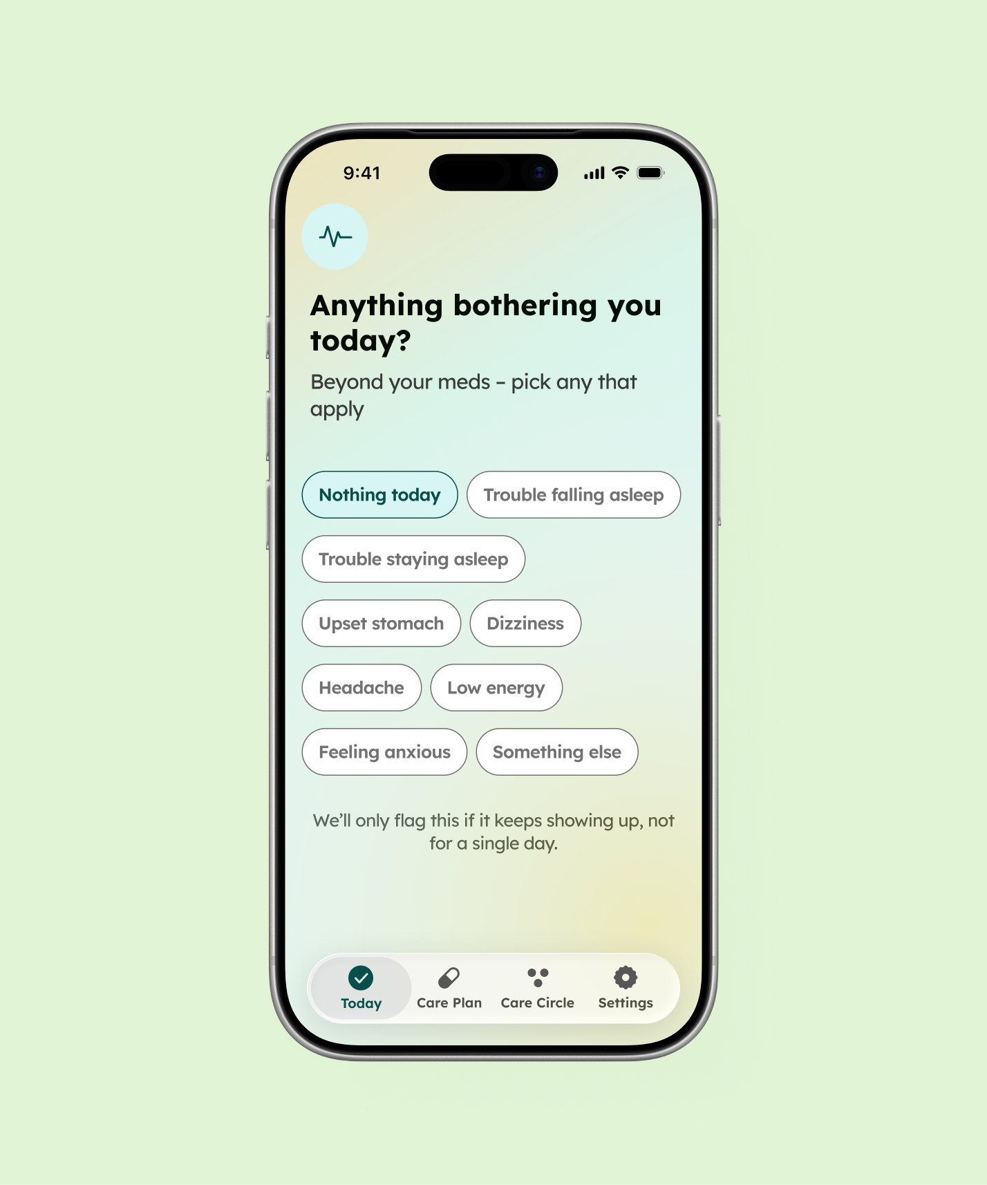
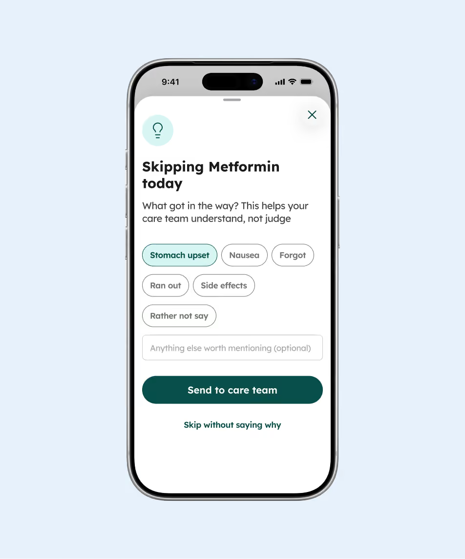
Design without the guilt. The clearest throughline across every screen is a refusal to shame the patient into better data. A skipped dose gets an optional, judgment-free reason instead of a forced confirmation. A single missed day stays private; only a pattern gets flagged. That decision runs all the way through the product, because an app that makes someone feel surveilled produces worse data, not better.
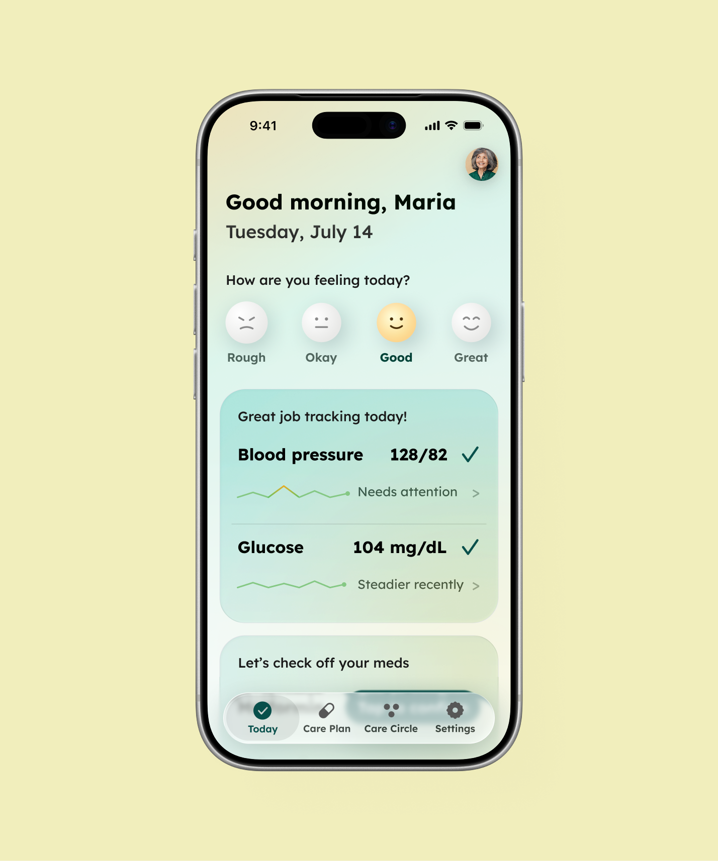
The entry opens with a human question — how are you feeling — before asking about tasks. A five-option self-evaluation lets patients add context beyond medication: dizziness, sleep trouble, or low energy. Nothing is required — once self-report feels obligatory, people stop or lie; a low-pressure "anything else worth noting" catches ambiguous signals patients wouldn't think to flag. It's deliberately separate from medication — symptom and adherence patterns mean different things downstream, and collapsing them hides that. Leading with it, rather than burying it after the task list, makes the entry feel like a check-in, not a form.
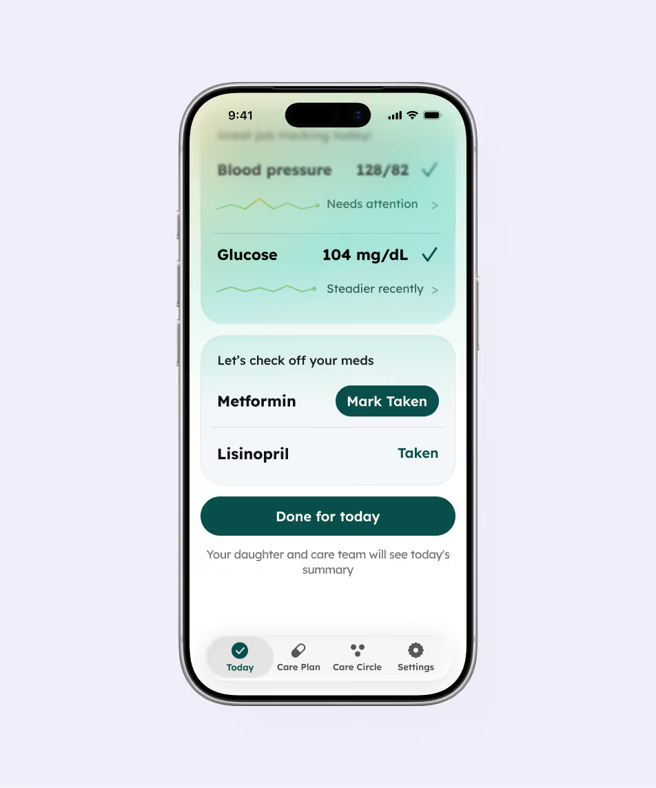
From there, the check-in itself is built to take under a minute. Two of three vitals sync automatically from a connected cuff and CGM — genuinely mainstream hardware, unlike the smart pillbox — leaving only one medication that needs a manual tap.
The reminder flow is designed for honesty instead of false precision. "Mark taken" and "Done for today" carry equal visual weight, and skipping invites a one-tap, judgment-free reason — turning a missed dose into a clinically useful signal instead of a guilt trip.
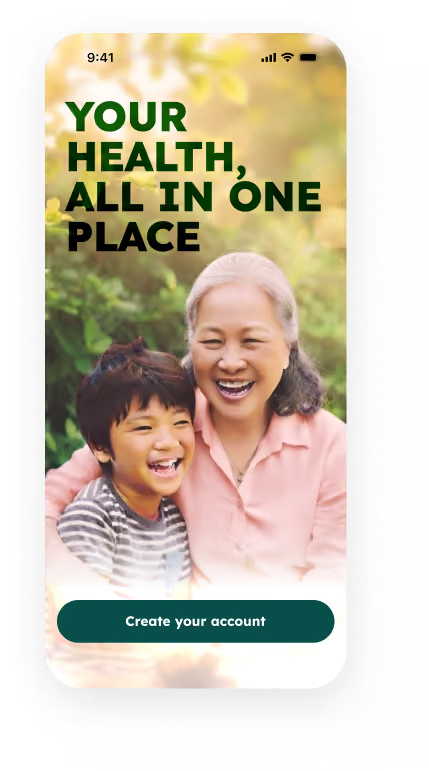
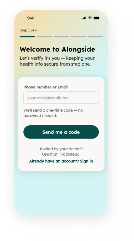
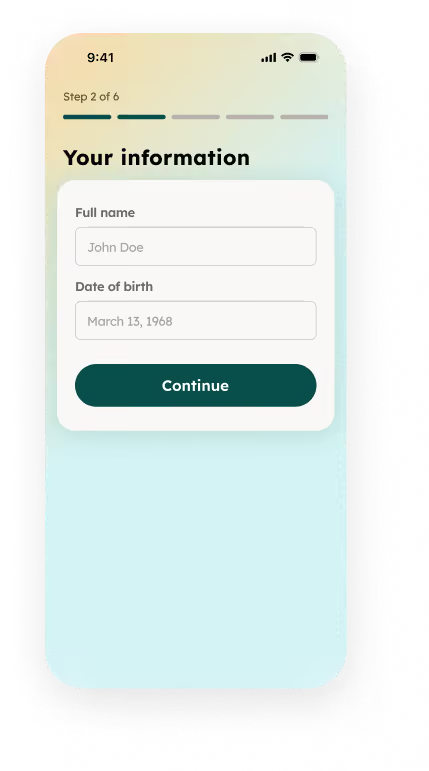
Account verification comes first, ahead of any health data entry — a deliberate departure from the general mobile-app wisdom to delay signup. The reason is compliance, not habit: the very next step collects real health information, and HIPAA guidance requires identity to be authenticated from the first point of PHI collection, not after the fact. Everything else about the step stays low-friction — a magic link or one-time code, not a form — so the compliance requirement doesn't cost the product its onboarding speed.
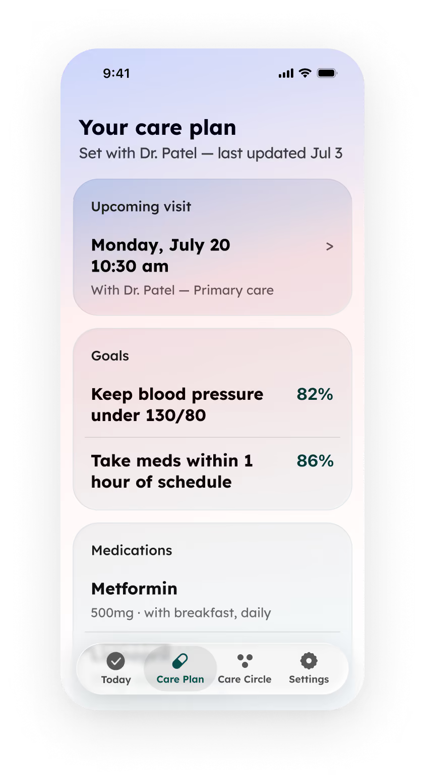
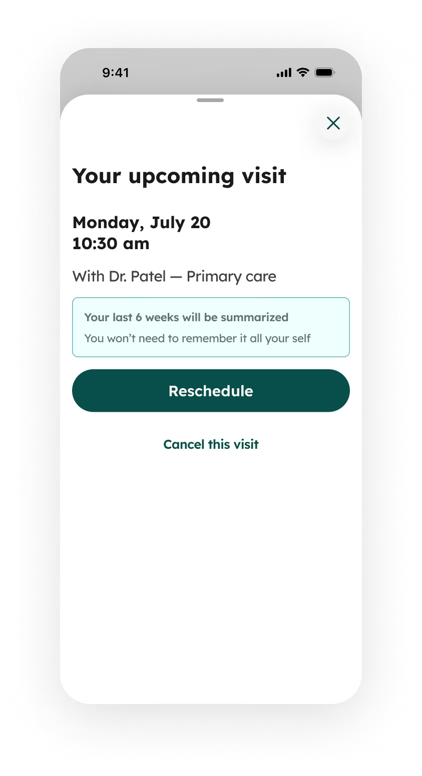
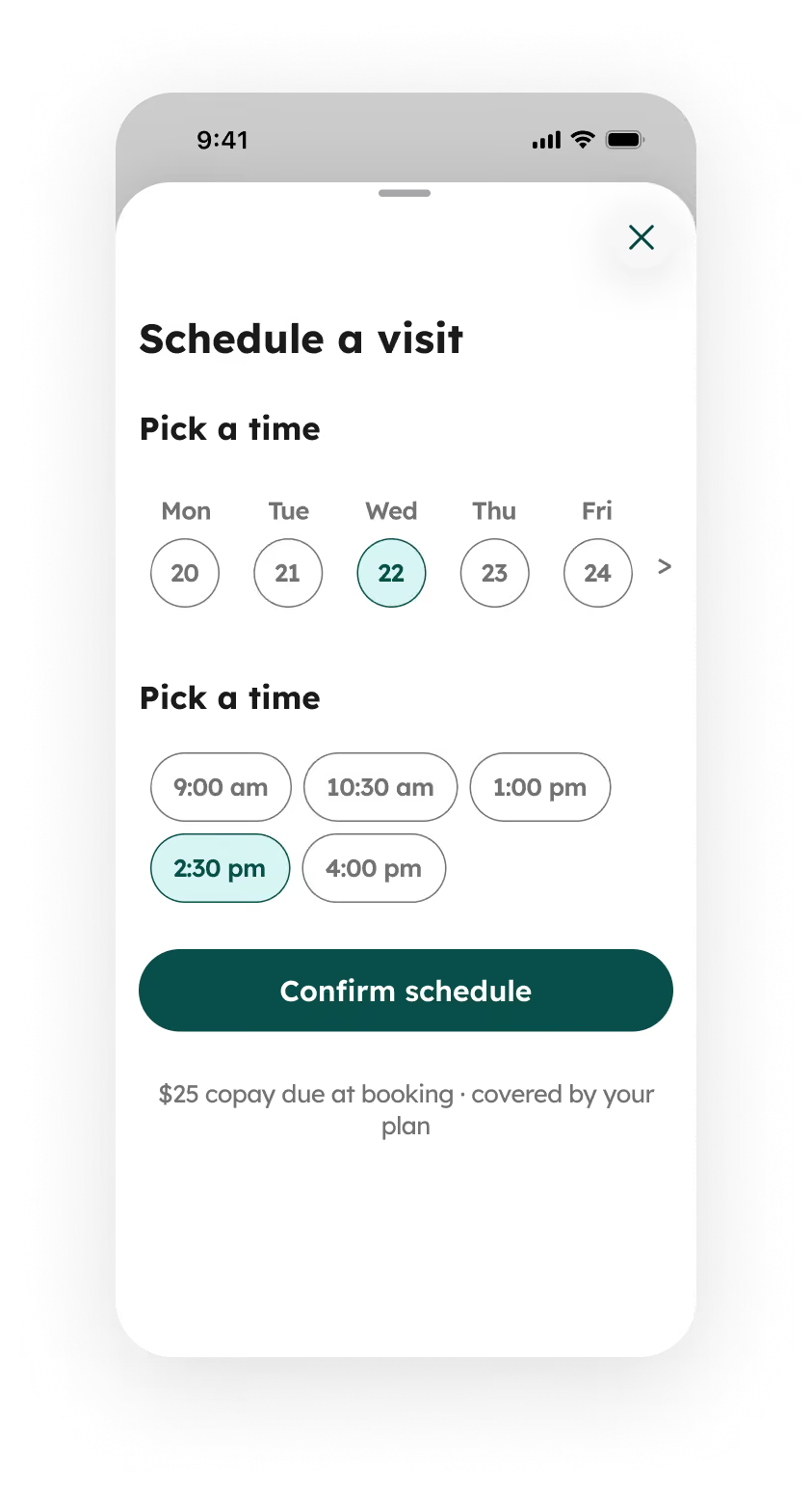
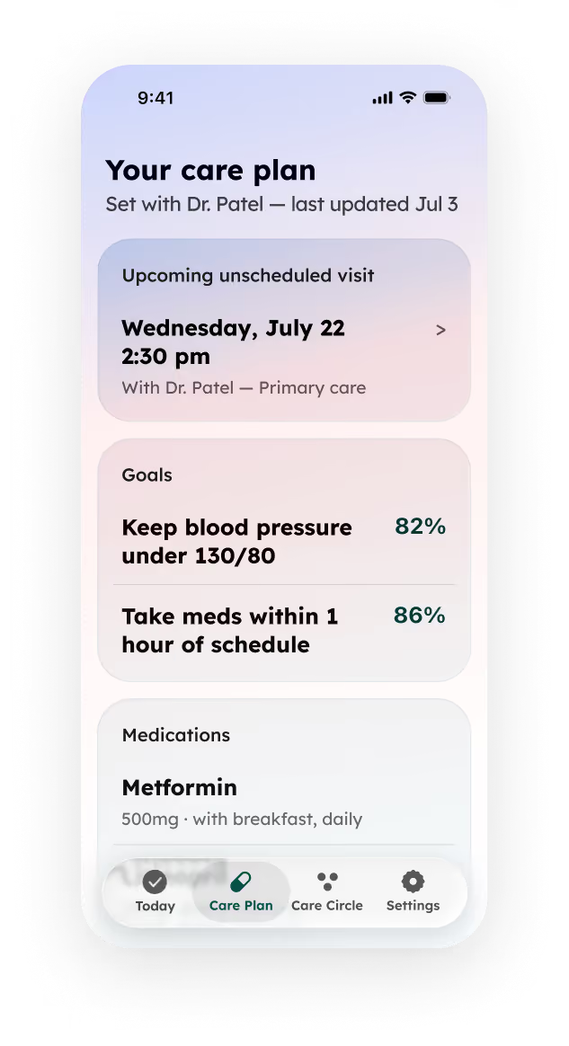
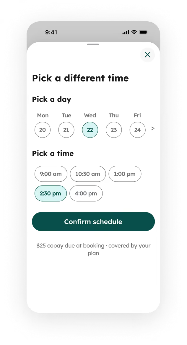
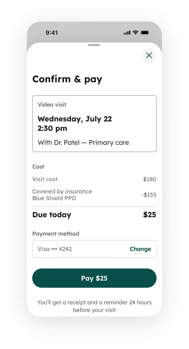
The care plan screen surfaces the next upcoming visit as a tappable card — date, time, and provider at a glance, without pulling focus from goals and medications below. Tapping it opens a detail view where the visit context is front and center: the full date, the provider, and a brief summary of what the visit will cover. Reschedule and cancel sit clearly separated, so reviewing a booking never feels like you're already changing it. The scheduling picker only appears once Reschedule is tapped — day and time selection on a single screen, with the copay noted before confirmation.
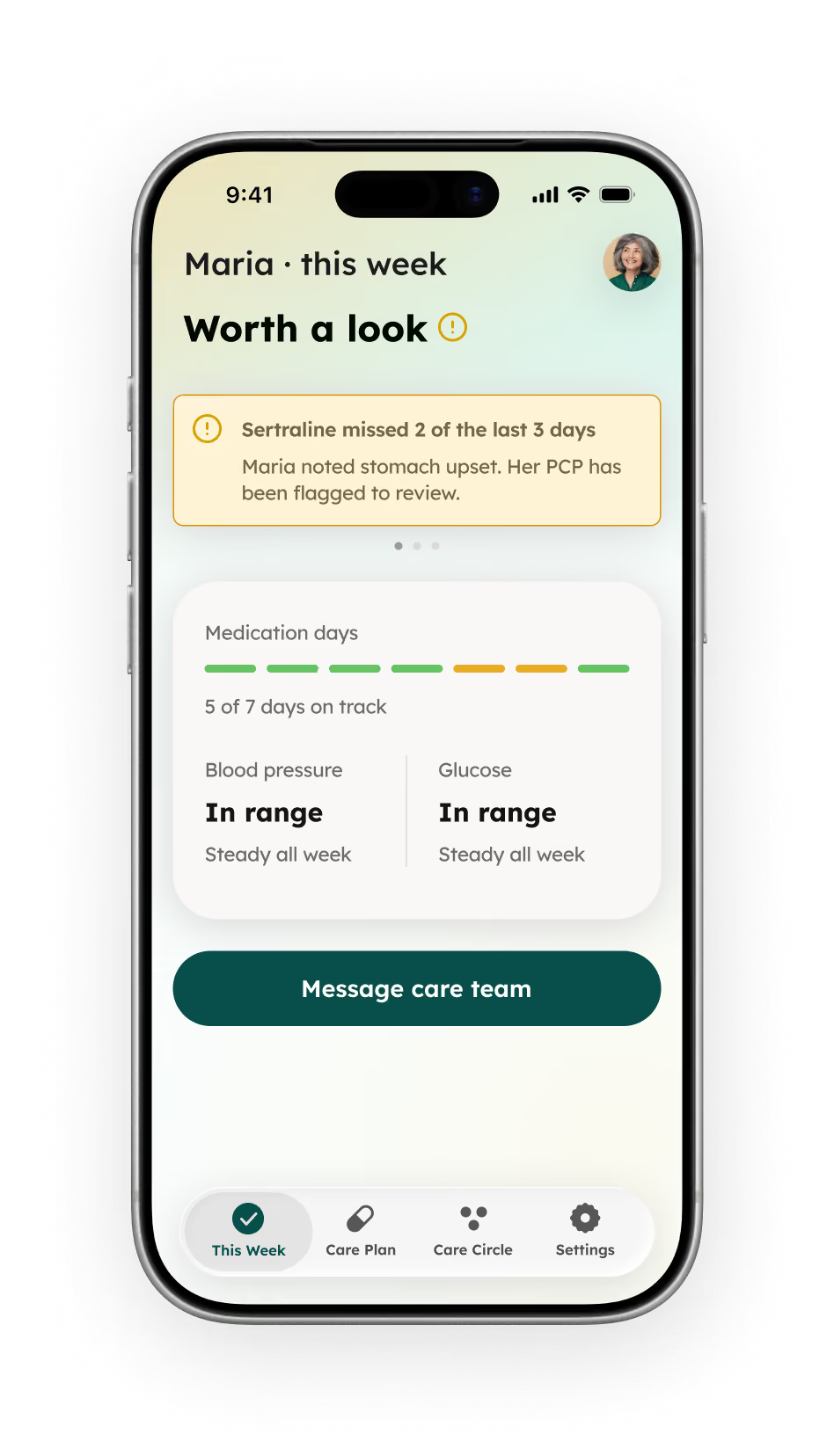
Built around reassurance, not raw data: a status line, not a log; "in range," not a number; and alerts that only surface once a pattern forms, carrying the patient's own context forward so they never have to explain themselves twice.
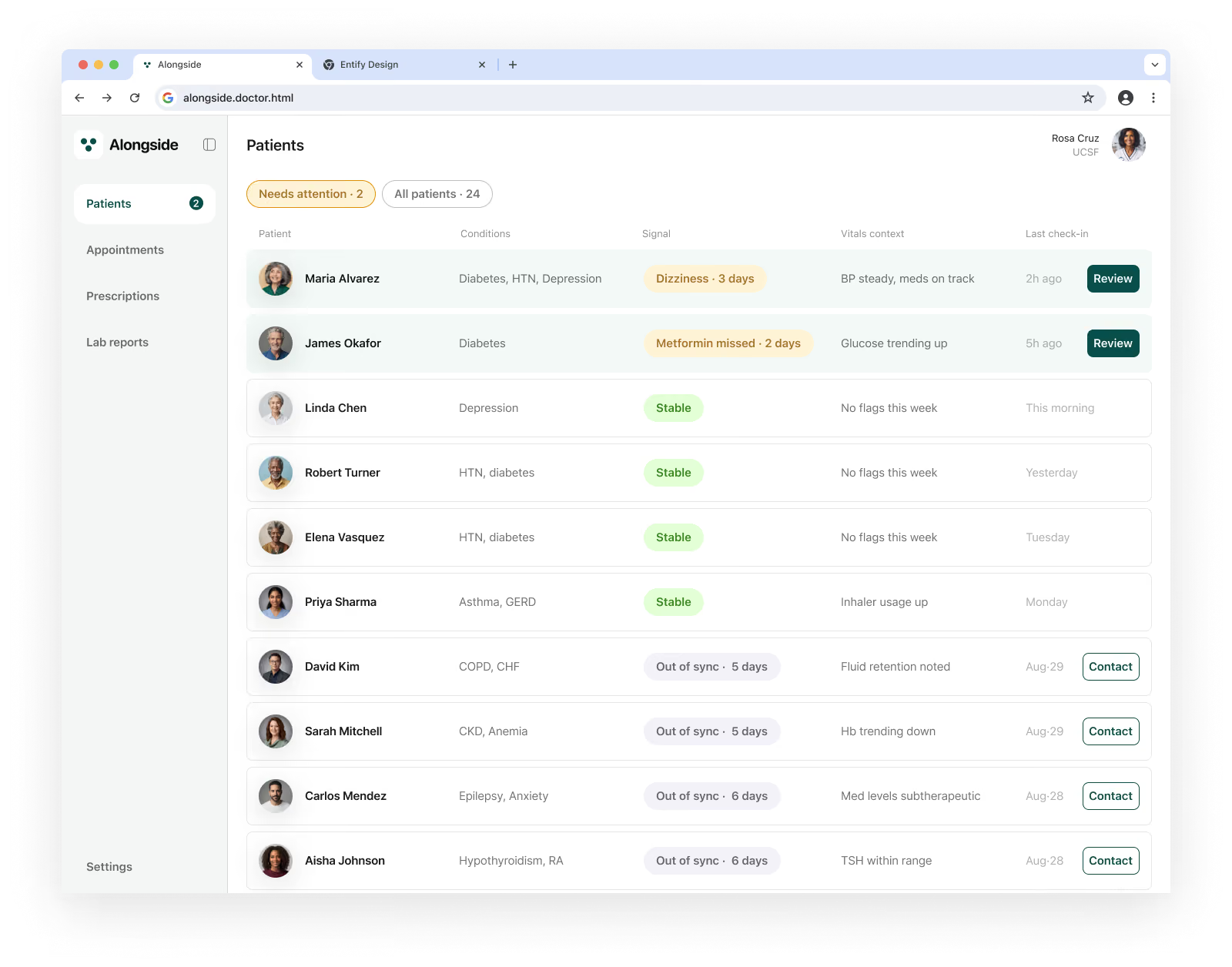
A prioritized panel view, not an inbox of raw alerts. The same signal reads differently depending on its vitals context — a medication gap with a known cause versus a physiological change worth an in-person look — letting a coordinator triage a full panel in seconds instead of opening every chart.
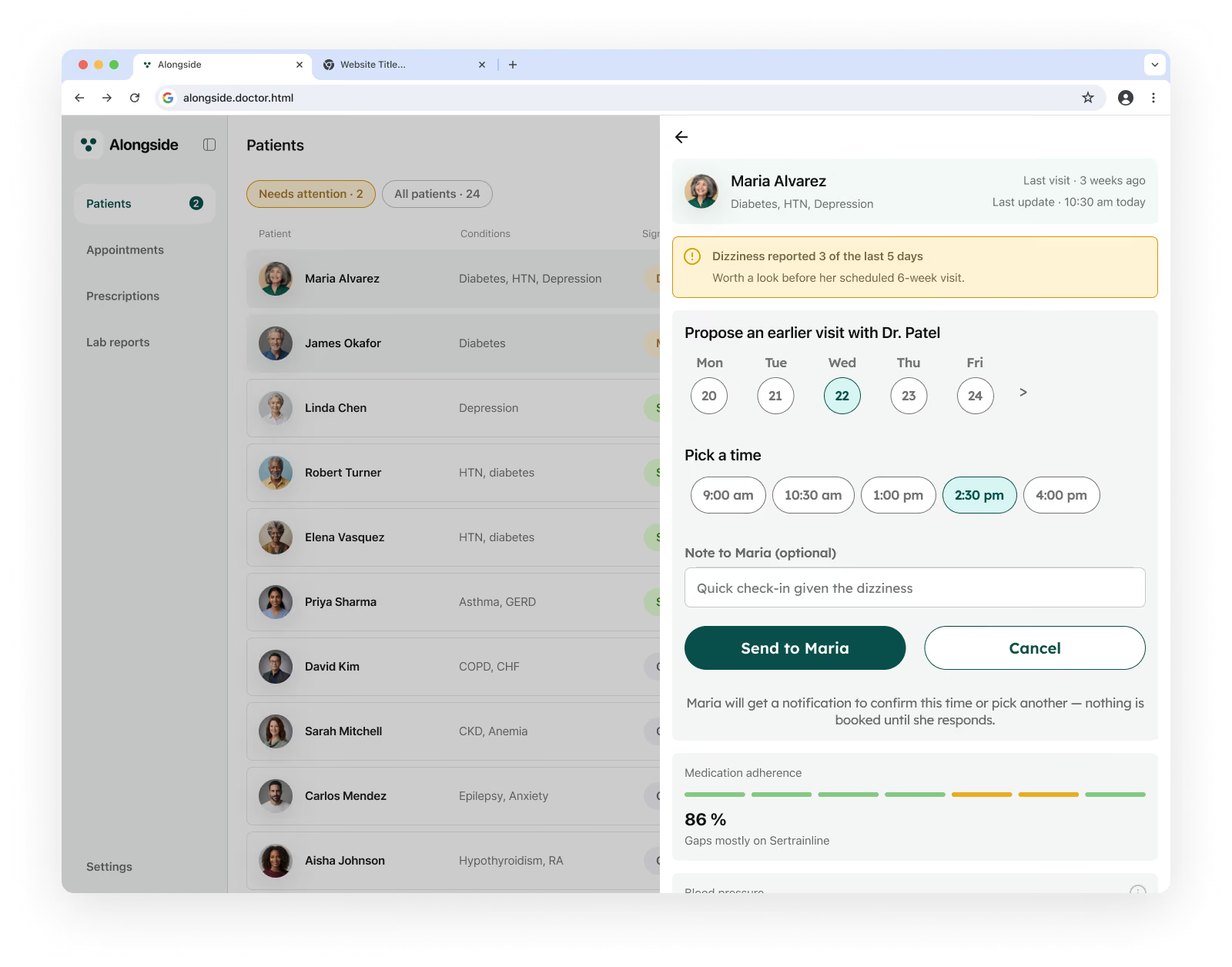
Care coordinator is notified the unusual pattern of the patient that the app detects and notify the care coordinator.
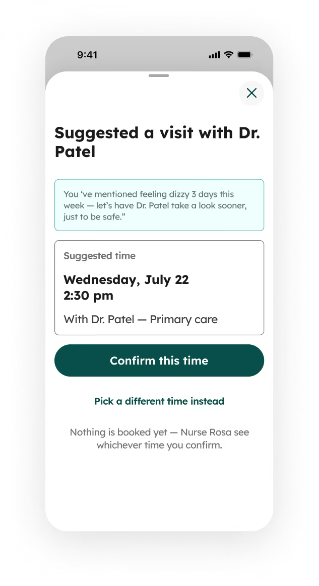
The care coordinator send an intervention for the patient for unscheduled early doctor visit.
The patient receives the unscheduled early doctor visit and either accept it or reschedule it as their convenient.
The prescription process follows to receive them at the registered pharmacy.
A pre-visit summary synthesizes six weeks into sparklines and a short "worth discussing" list, sourced across the patient, caregiver, and coordinator — so the fifteen-minute visit goes to decisions, not data-gathering. Every sparkline is tappable into a full chart, a two-level pattern borrowed directly from clinician dashboard research showing that physicians want a fast read and the ability to drill into the raw numbers, not one or the other.
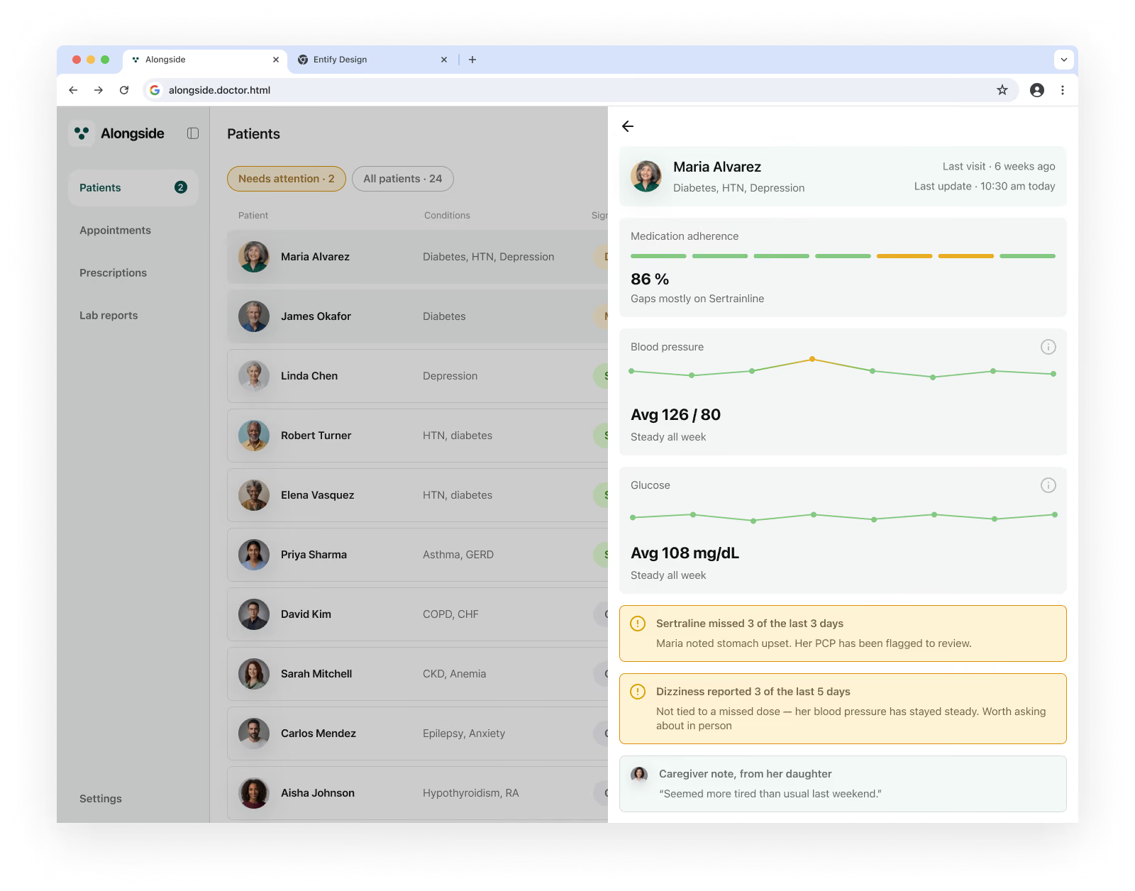
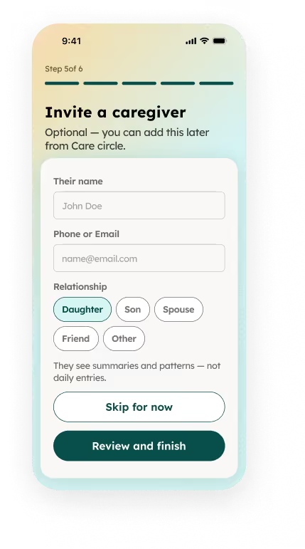
Alongside was designed to close three specific, named gaps between four people who are all managing the same condition without realizing how much they could help each other.
With Alongside, the same week, now connected. A missed dose stays private unless it becomes a pattern — no guilt, no false alarms. The caregiver's context attaches directly to the data it explains, reaching the coordinator without a single phone call. The doctor opens a pre-synthesized summary instead of a blank page. Every gap from the current user journey maps to a specific screen built to close it — not a general promise, a named fix.
Every gap identified in the current-state research — the missed dose no one else sees, the caregiver locked out of decisions, the coordinator working blind — maps to a specific screen built to close it, not a general "better communication" promise.
By designing for honest self-report instead of assuming perfect sensor coverage, the product is built to produce data that reflects what actually happened, not what a patient feels pressured to claim.
The two-level pattern — fast summary, optional depth — runs from the patient's trend teaser to the doctor's sparkline, respecting that a caregiver, a coordinator, and a physician all need a different shape of the same truth.
Brand Strategy
Brand Design
User Research
Persona & Journey Mapping
Product Design