Design & AI Workflow
How We Built Reusable Components with Figma MCP, Storybook MCP, and Claude Code
By Entify design team
·
5 min read
·
6/9/2026
When we finished building Lull — our generative ambient music app — we were genuinely pleased with how it looked. Claude Code had read our Figma design system through MCP, pulled the exact design properties, and reproduced the visual language faithfully. Buttons, dials, colour tokens — all correct.
What it didn't do was build anything reusable.
Every element in that app was hardcoded in a single HTML file. One screen, no component library, no design tokens wired to React — just fast, working code. For Lull, that was fine. But the moment we started thinking about building something larger, we ran into the wall that shortcut always creates.
This article is about what we tried next, and what a Claude Code workflow with Figma MCP and Storybook MCP actually looks like when you do it properly.
Why Lull's approach had a shelf life
We made a deliberate choice when building Lull: no reusable components. The app had one screen. Building a component library for a one-screen ambient music tool would have been over-engineering with extra steps.
But that choice doesn't scale. When we decided to use the same AI-assisted workflow to rebuild our own company website — a real multi-page product with a full design system — we had to think differently.
The problem with hardcoded components isn't that they look wrong. It's that they can't be maintained. Change a button style in one place, and you've changed it in exactly one place. The next screen still has the old version. In a production codebase, that becomes expensive fast.
We needed Claude Code to reuse components, not reinvent them.
What we had going in
The quality of what came out was directly proportional to the clarity of the design system
Our starting point was unusually solid. We had a complete design system in Figma: variables for colour, spacing, and typography; component variants for interactive states; and finished screen mockups for the full website. Figma variable exports JSON.
This mattered more than we expected. The quality of what came out was directly proportional to the clarity of what we put in.
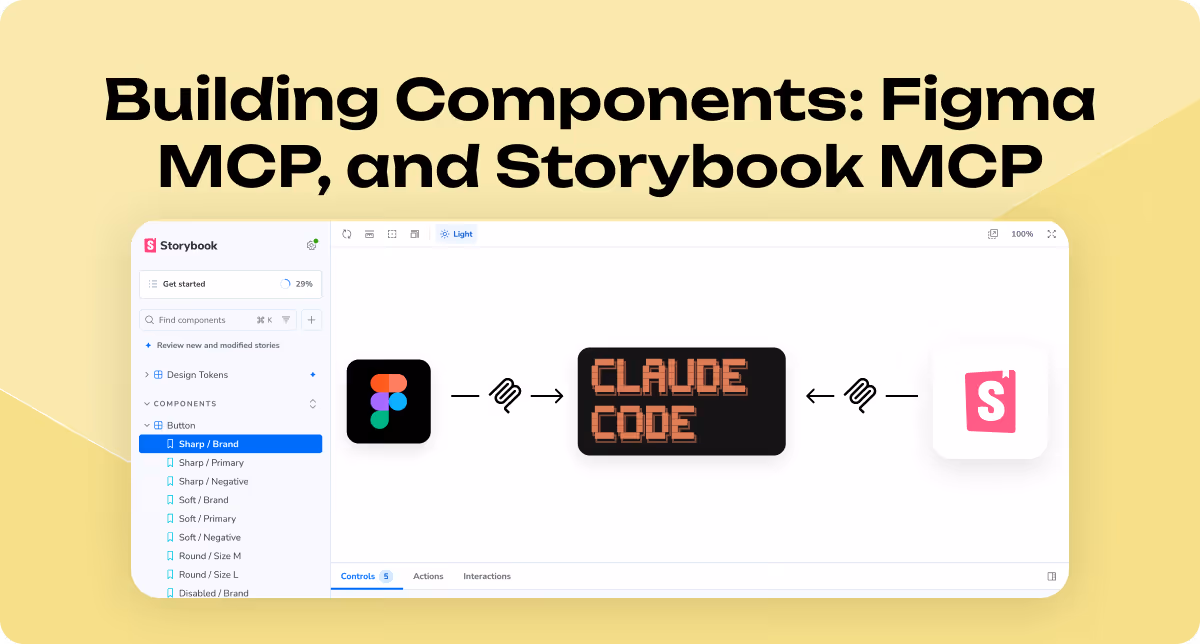
The three-step workflow
By giving Claude Code a live, browsable source of real components (Storybook),
we gave it something to reach for instead of improvising.
Step 1: Map the design system. .We asked Claude Code to inspect the Figma design system directly via Figma MCP — reading the properties and values of each variable from the source — alongside the exported JSON files for component definitions. The goal wasn't to generate UI yet. It was to establish a shared vocabulary between our design decisions and the code it would write. Claude Code built the CSS design token structure from this.
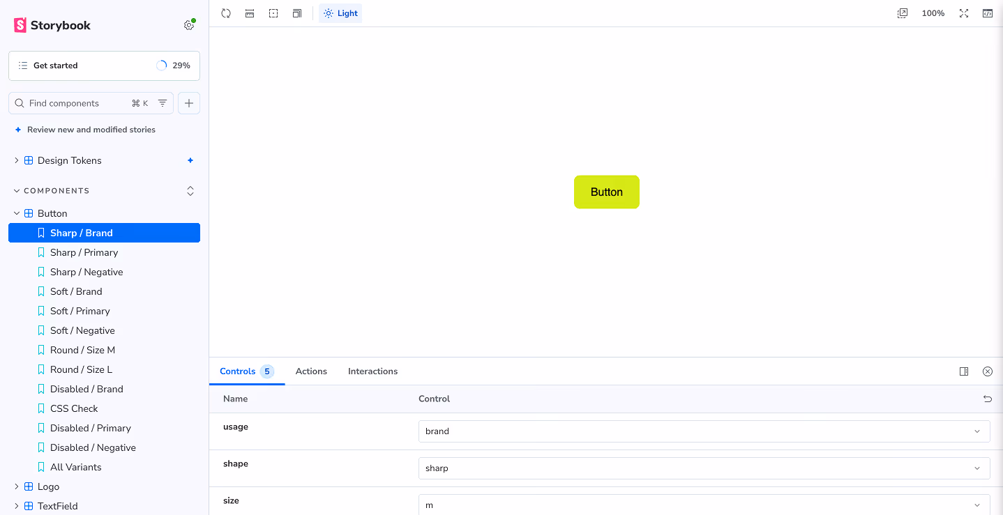
Step 2: Build and review components in Storybook. .With the tokens in place, we asked Claude Code to build a library of interactive React components in Storybook — each one using the CSS tokens, not hardcoded values. We reviewed every component ourselves before signing off. This step was slow. It was also non-negotiable. Some components came back correct. Others needed corrections to spacing, interactive states, or prop structure. Human review at this stage prevented those mistakes from propagating forward..
Step 3: Build the website using Storybook MCP. Once the component library was approved, we asked Claude Code to build the website from the Figma mockups — with a specific constraint: use the existing Storybook components instead of writing new ones. This is where Storybook MCP became the key piece. By giving Claude Code a live, browsable source of real components, we gave it something to reach for instead of improvising.

What actually happened
This workflow doesn't remove the need for a human who understands both the design and the code.
The component reuse worked — better than we expected, and less perfectly than we hoped.
Claude Code pulled from Storybook accurately in most cases. The design tokens carried through. The consistency across pages was noticeably better than anything we'd produced by starting from scratch each time.
But we still caught mistakes. Component props used incorrectly. Layout decisions that drifted from the mockup. A few spots where Claude chose to write new code rather than use an existing component when the existing one would have worked fine.
The review step remained essential. This workflow doesn't remove the need for a human who understands both the design and the code. What it does is reduce how much of the routine work that human has to do.
What this revealed about AI-assisted design systems
The biggest thing this experiment confirmed: AI execution rewards design preparation.
Claude Code didn't struggle because it's a poor tool. It struggled where our inputs were ambiguous — where the design system had gaps, or where a component variant didn't quite cover the use case. In those spots, it made a decision. Sometimes the right one, sometimes not.
The studios and teams who will get the most out of this workflow are the ones who've already done the hard work of defining their design language before asking AI to use it. The design system isn't the optional part. It's the prerequisite.
Three things worth trying
If you're considering a similar workflow, here's what we'd recommend based on what we learned:
Use Figma MCP to let Claude Code inspect your variables directly — don't rely on it inferring values from visual inspection. Give it the source of truth, property by property.
Review components in Storybook before connecting them to anything. The mistakes at that stage are small and contained. The same mistakes at the website-build stage are expensive.
Give Claude Code an explicit instruction to use existing components rather than create new ones. Left to its own decisions, it will sometimes reinvent rather than reuse. The constraint is worth stating clearly.
The honest version of the result
"Better" came with conditions: a complete design system going in, human review at every stage, and some patience for the cases where it got things wrong.
This workflow is genuinely useful. It's also not magic. The output was better than what we'd have produced by prompting from scratch — more consistent, better aligned with the design system, easier to maintain.
But "better" came with conditions: a complete design system going in, human review at every stage, and some patience for the cases where it got things wrong.
The question we keep asking ourselves: at what project size does this investment in preparation start paying back faster? We're not sure yet. We think it's somewhere between a three-page marketing site and a full product — but we'd be curious where others have found the line.
If you've tried something similar — or hit the same wall we hit with hardcoded components — we'd genuinely like to hear how you handled it.
If the way we work with design systems is the kind of thinking you want to bring into your product, take a look at entifydesign.com/our-works.
