
A global connected-vehicle brand's product had scaled without a shared design system — every screen carrying its own colors, type, and component sizing, chosen independently by whoever designed it. I audited more than 100 production screens one by one, then rebuilt the visual language from what the product actually contained: a token-based color and type system derived from real usage, built alongside front-end engineering rather than handed to them after the fact.
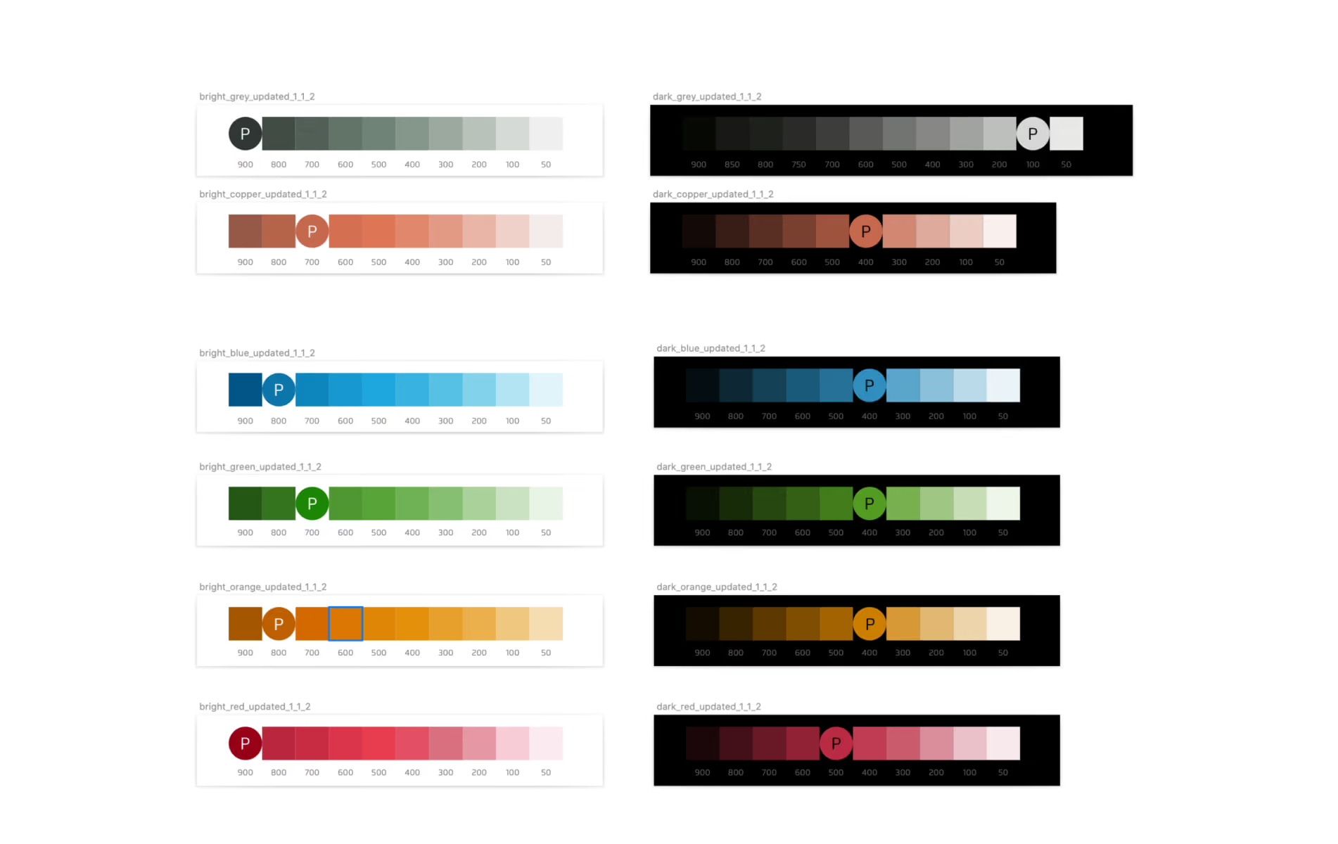
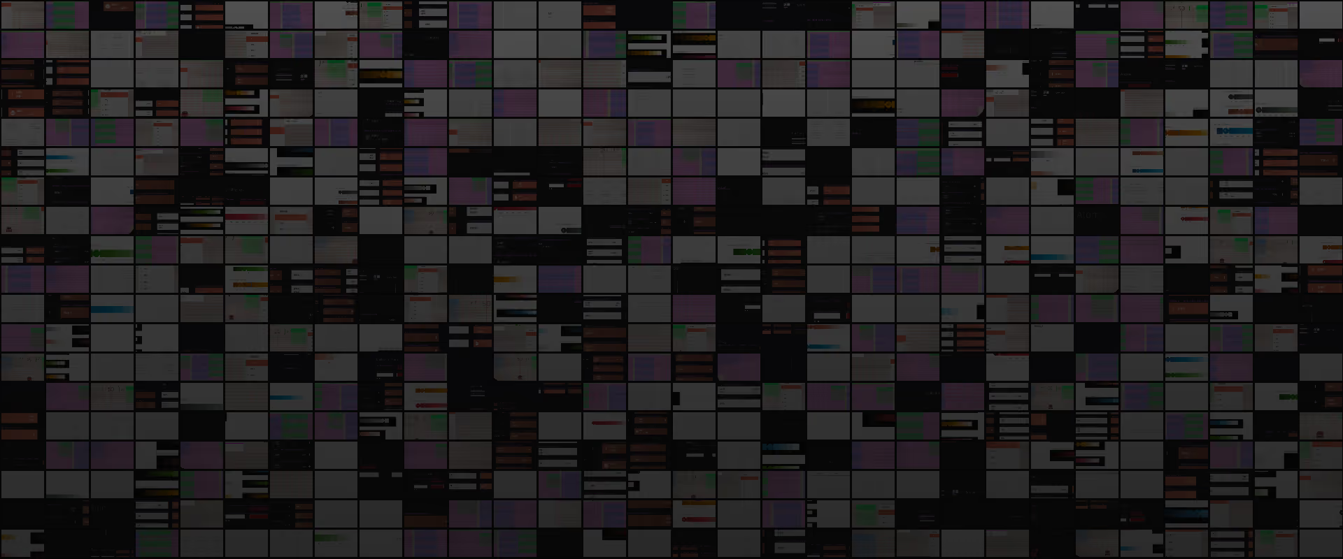
A design system that scaled by accident is the same as no design system at all. Every designer had been choosing colors, type, and component sizing screen by screen, for as long as the product existed. None of it was visible as a single problem until it was measured — individually, each screen looked reasonable; laid side by side, there was no consistent visual language anywhere in the product.
The audit found:
The cost wasn't just visual. Without a shared system to build against, front-end engineering was struggling to implement design output from the entire design team — screens couldn't be built properly because there was no consistent set of components, colors, or type to implement against. This was a real delivery bottleneck, not a polish problem.
The audit. I reviewed all 100+ screen mockups one by one, cataloging every color, type style, and component variation directly in Figma — not a sampling exercise, every screen was logged, because the goal was to know the real shape of the problem before designing the fix.
Start from what the product actually contains, not from an ideal system imposed on top of it.
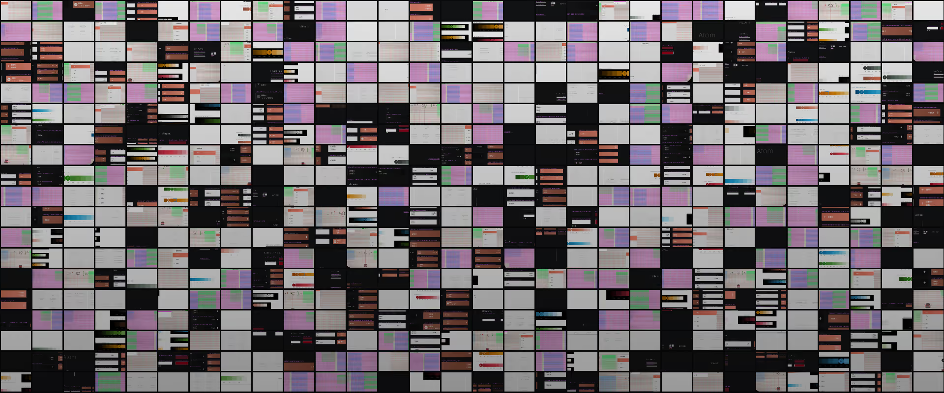
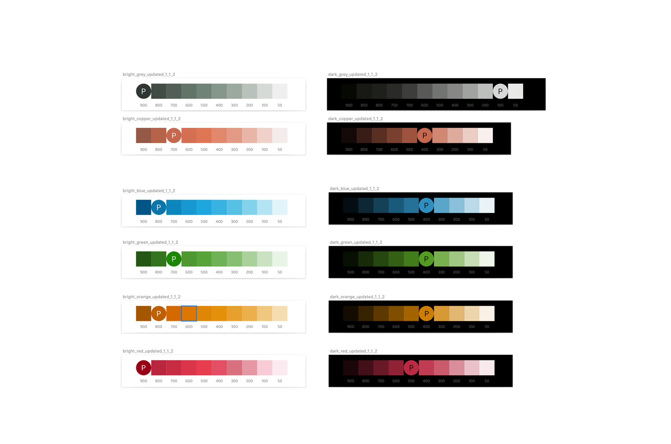
The min-max method. For type, I identified the smallest and largest font sizes actually in use across the entire product, then built a type scale spanning that real range — every step anchored to what the product had already proven it needed, not chosen because it looked right in isolation. I applied the same logic to color: for each color family, I defined the shade range the product actually required, then selected a handful of representative shades across that range instead of preserving every ad hoc variation that had accumulated.
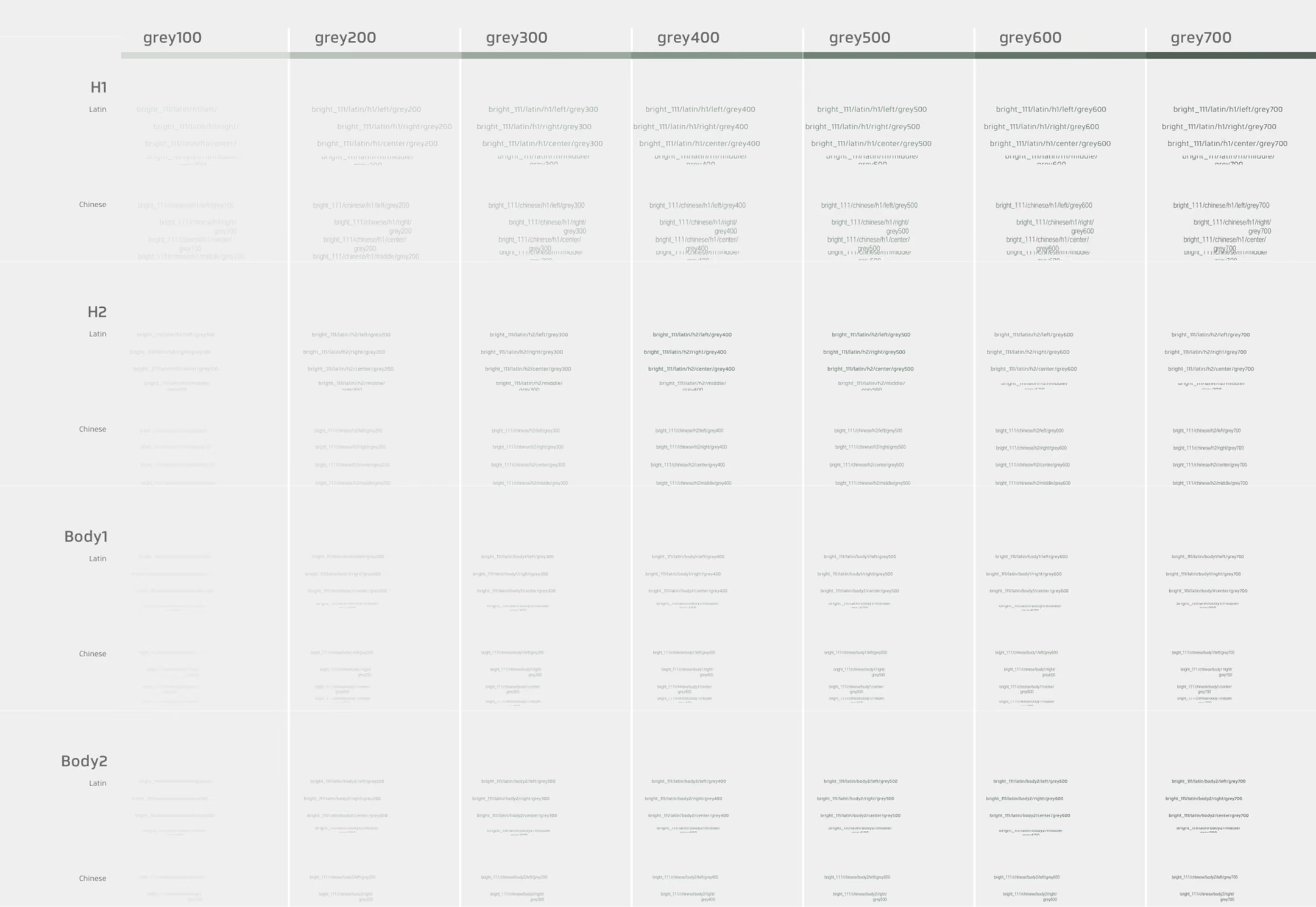
Designing within real constraints. A clean system on paper isn't useful if engineering can't build it. I worked directly with front-end engineers to validate every new component against the technical limits of the Android Auto version the team was shipping on, so the system was buildable from day one — not a redesign that would need to be renegotiated later.
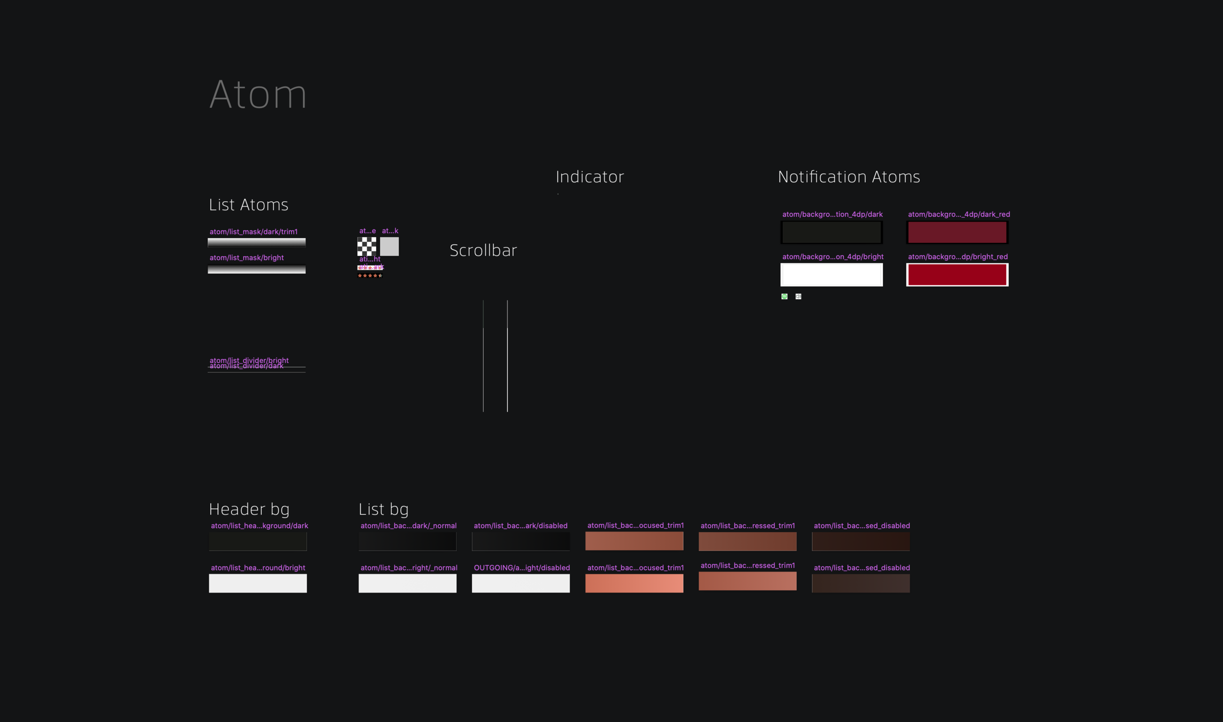
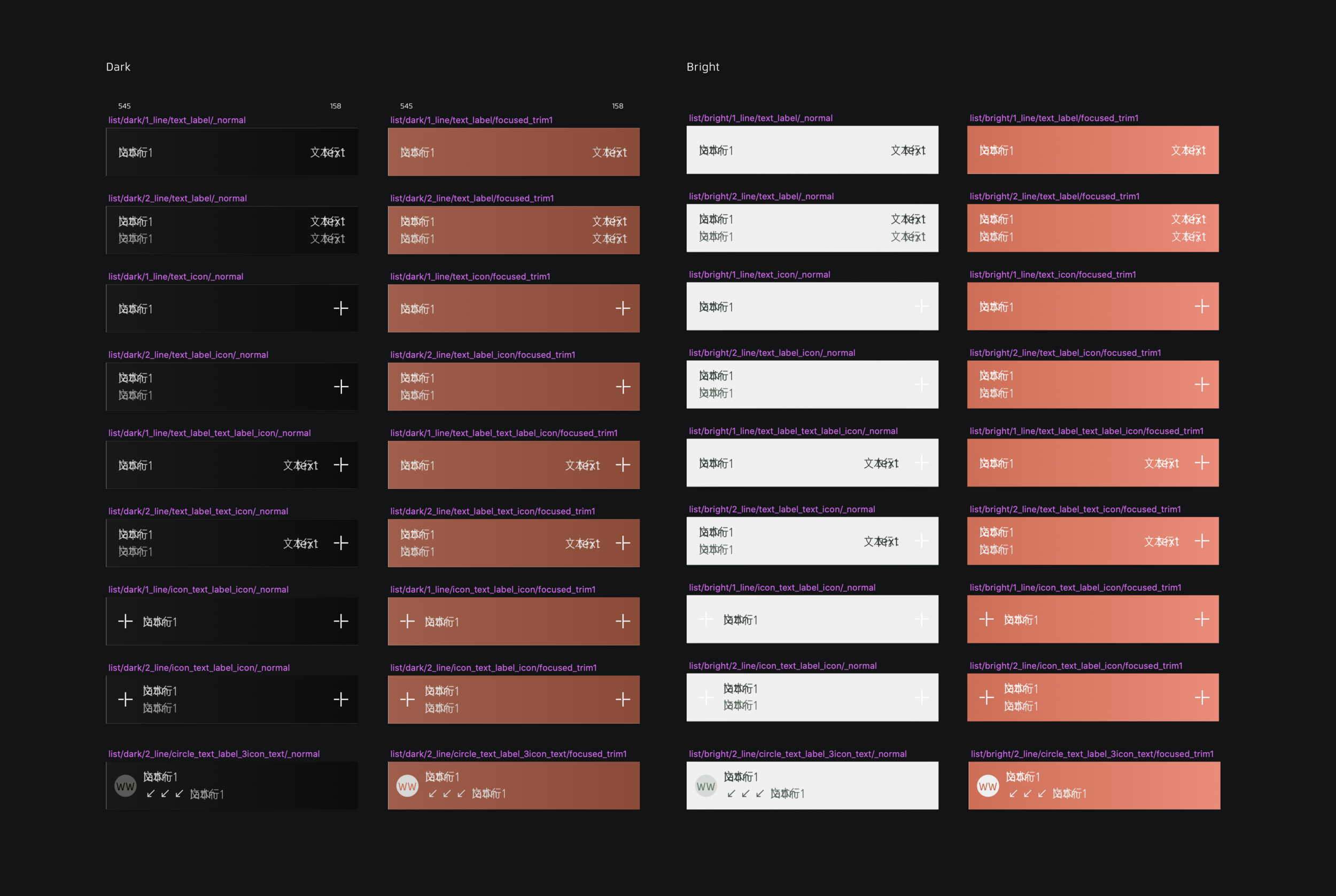
A system only works if it's the only option.
This audit replaced a design system that had grown by accident with one that was measured, engineered, and adopted as the only way to work going forward.
10+ per-color variations became defined shade scales; 100+ freely-chosen type styles became a single, evidence-based type scale.
Front-end engineers went from struggling to implement inconsistent design output to building against a system validated for their actual platform constraints.
Every designer adopted the new system for all new work going forward, with ongoing maintenance built in rather than left to drift again.
Design Systems
UI Audit
Design Tokens
Component Architecture
Cross-Functional Collaboration
Documentation & Handoff