Design & AI Workflow
Designing Alongside, a Chronic-Care Healthcare App — What Building It With Claude Taught Me.
By Entify design team
·
6 min read
·
7/19/2026
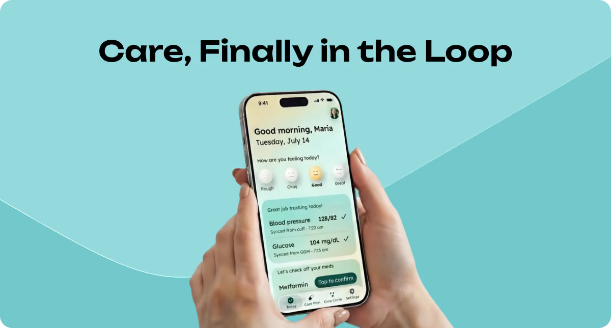
A case study in using Claude as a research and design partner, start to finish — market research, personas, journey maps, onboarding logic, and the wireframes themselves.
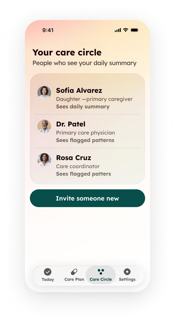
Alongside is a chronic-care coordination app that connects a patient, their family caregiver, their nurse care coordinator, and their doctor around one shared thread of daily data — replacing the four disconnected views each of them works from today with one honest picture.
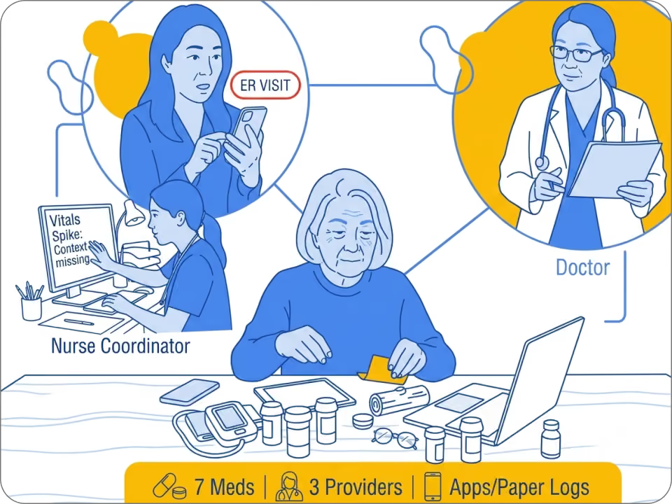
A patient juggling seven medications and three providers. A caregiver who finds out about a bad week only after it's already an ER visit. A nurse coordinator triaging vitals for dozens of patients with no context for what a spike actually means. A doctor rebuilding six weeks of someone's life from memory in fifteen minutes.
Four people. One condition. Four disconnected pictures of the same story.
Alongside is built around Maria Alvarez — type 2 diabetes, hypertension, mild depression — and the three people orbiting her care: a remote family caregiver, a nurse care coordinator, and a primary care doctor she sees every six weeks. The product's whole thesis is that none of the existing chronic-care apps treat this as a four-person problem. They're built for the patient, then everyone else gets bolted on as a notification.

Maria Alvarez, 58 — the patient
Type 2 diabetes, hypertension, and mild depression. Manages seven medications and sees three providers. Not tech-averse, but overwhelmed by juggling separate apps and logs for a condition that touches every part of their day.

Her daughter — the caregiver
Remote, informally stepped into the role with no onboarding. Wants reassurance, not another dashboard to interpret. Currently relies on phone calls and texts that only tell her something's wrong after it already is.

Nurse Rosa — the care coordinator
Manages a full panel of patients, triaging incoming vitals and symptom reports daily. Needs to know who actually requires their attention today, and needs the context to trust that signal.

Dr. Patel — the primary care physician
Sees Maria roughly every six weeks, for fifteen minutes at a time. Needs a synthesized trend, not a raw data dump, so the visit goes to decisions instead of data-gathering.
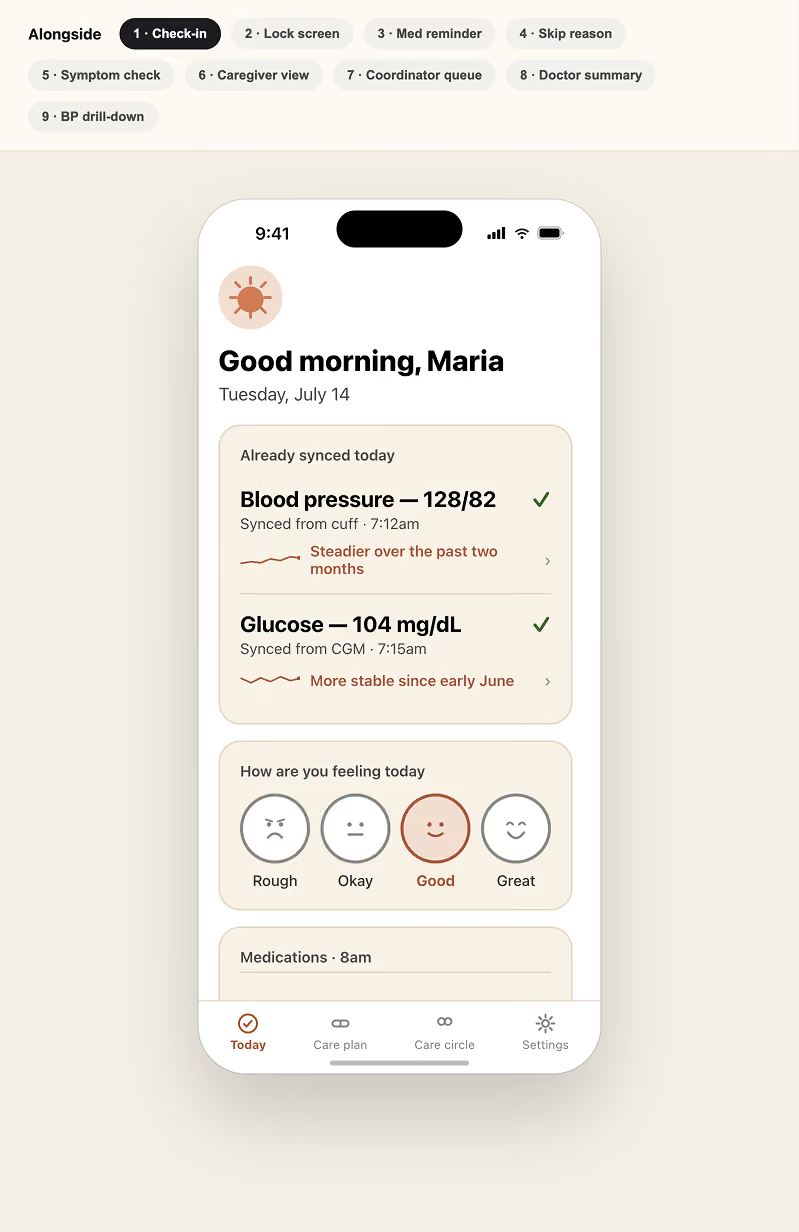
Exploring visual direction in Claude Design
Once the wireframes existed, I didn't go straight into Figma. I ran them through Claude Design first — gave it a brief on the tone I wanted (calm, warm, not clinical-looking) and asked it to explore a few visual directions without committing to one version. That gave me real options to react to instead of a blank canvas, before I sat down and designed the final screens myself.
What Claude was actually good at
Doing the research instead of guessing at it.
Every persona in Alongside is built on real published research, not invented plausibility — caregiver burnout studies, alert fatigue in remote patient monitoring, the 29–46 minutes physicians already spend in the EHR every day. When I asked for market sizing, I got real funding figures, not a vibes-based "healthcare is big." That distinction mattered every time a design decision needed defending.
Stress-testing its own assumptions before I had to.
The clearest example: smart pill dispensers seemed like the obvious answer to "how do we know if someone took their medication." Before designing around that assumption, Claude actually researched the category — and found it's a $100–$1,000+ niche product, concentrated in elderly-care networks and clinical trials, not something Maria would ever own. That one finding reshaped the entire medication-tracking flow around honest self-report instead of sensor data. It would have been easy to just design the "smart" version and never learn that.
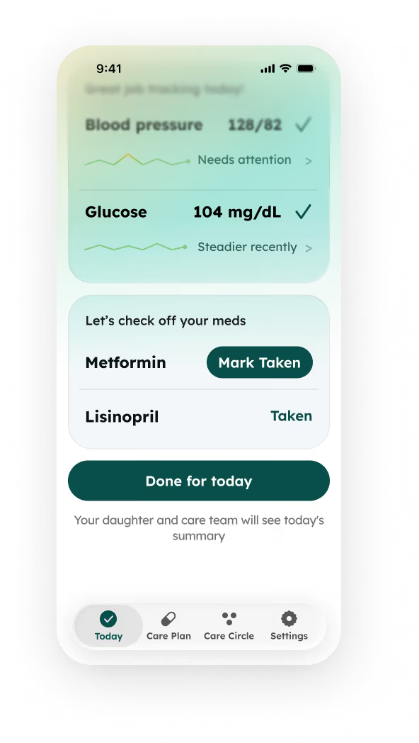
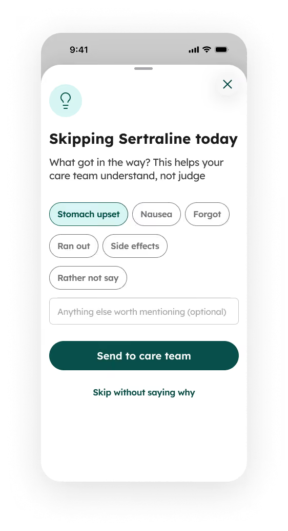
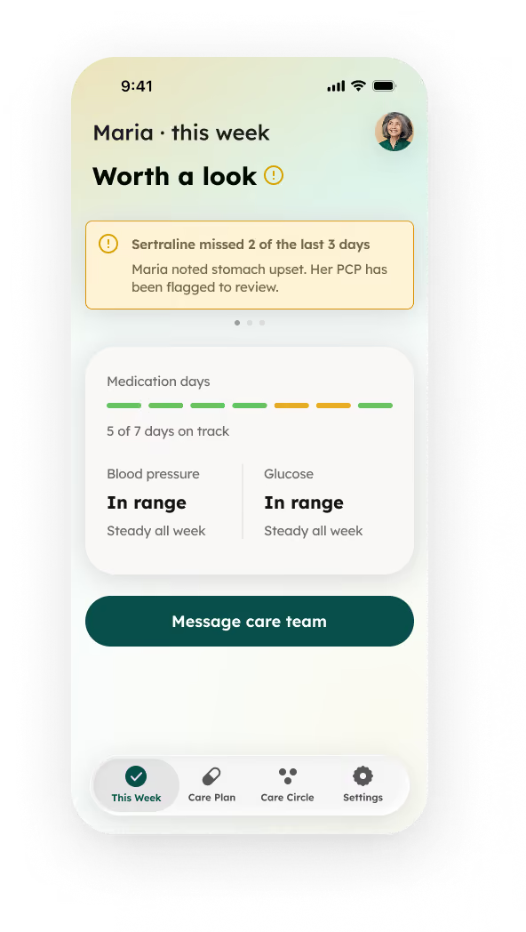
Holding one design principle across dozens of screens' worth of decisions."No guilt" wasn't a mood-board line — it turned into a specific rule I could point back to weeks later: skip-reasons stay optional, a single missed dose stays private, alerts only surface once a pattern forms, "reassurance not raw data" as a caregiver design directive. Every time a new screen came up, that principle was still there, still consistent, without me having to re-explain it.
The tool did the research and the most of the design works.
I did the judgment calls — which constraint was real, which assumption was worth challenging, and when to stop.
What surprised me
How much of the "design" work was actually me deciding, not building.
Nurse care coordinator or doctor as the primary clinical persona? Lock the prescriptions step or leave it open? How far a gender-neutral language pass should go — every pronoun, or leave "daughter" alone as a relationship term? Claude built strong, well-reasoned cases for the options in front of me. I made the calls. The making got faster. The deciding didn't.
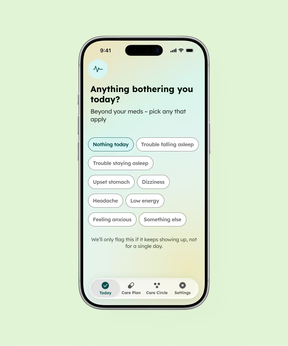
The honest summary
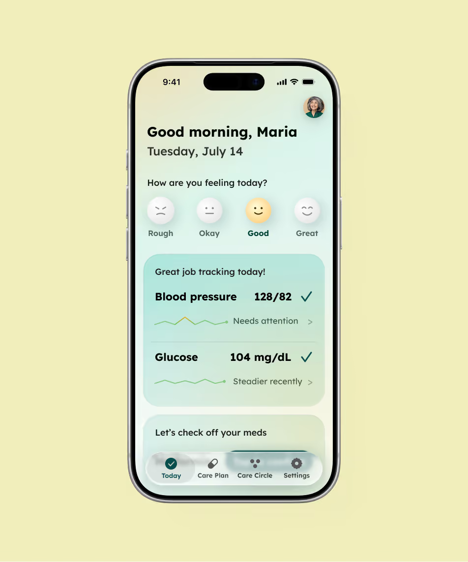
Building Alongside start to finish — market research, four personas, two journey maps, nineteen wireframes, a full onboarding flow, and the write-up itself — happened as one continuous thread, not a series of disconnected asks. The place I added value wasn't drawing the screens. It was knowing what a chronic-care app actually needs to get right, and catching the moments where a plausible-sounding answer wasn't a researched one.
Full case study, personas, and screens are up at entifydesign.com/our-works